





See the system. Find the pressure points. Target the reform.
Brand guidelines
Brought into focus.
The Justice Audit identity is an instrument: a viewfinder that brings the whole justice chain into view, and a single amber node where the pressure lies. This page sets out how to use it well.
01Logo
One mark. Four versions.
The horizontal lockup is the primary logo. Use the stacked lockup in square or narrow formats and the mark alone where the name is already present. Use full colour wherever possible; mono versions are for one-colour print and reversals.
02Clear space & minimum size
Give it room to read.
One unit, X, governs the lockups: half the height of the mark. Keep at least X clear on every side. The wordmark’s capitals stand at 0.55 of the mark, its hairline sits on their optical centre, and the gap between mark and name is ¾X.
Minimum sizes

- Horizontal 120px screen · 30mm print
- Stacked 64px screen · 18mm print

- Mark 16px screen · 5mm print
Below these sizes use the mark alone. For favicons and app icons use the prepared icon set, which carries a slightly heavier hairline and larger nodes for small-size legibility.
03Construction
The viewfinder, on the grid.
The mark is drawn on a 32-unit square. Its edges fall on whole units, so at 16px every stroke is exactly one pixel. The bracket weight matches the stems of the wordmark; the pressure point is larger as well as amber, so it still reads in one colour.
- Grid
- 32 × 32 units
- Brackets
- 2u stroke, 9u arms, 14u open – a frame, not a box
- Nodes
- Ø4.8u on a 7.5u pitch, centred on the axis
- Pressure point
- Ø6.2u, Signal #E2672F
- Hairline
- 1u, node centre to node centre

04Colour
Calm ground. One signal.
Ink and Paper carry the identity; Teal is the heritage colour for links and data. Signal amber is reserved for meaning – the pressure point, the primary action, a key number. Never decoration.
Ink#0A2530Primary dark. Hero and feature grounds, headings on light.
Paper#F5F2EAPrimary light ground. Warm bone, not white.
Signal#E2672FPressure point, primary action, key data only. Use #B84D1A for small amber text.
Ink 2#0F3441Raised surfaces on dark
Teal#13586BHeritage. Links, data
Teal soft#5E8C99Muted data, lines on dark
Paper 2#ECE7DBAlternate sections, cards
Line#D9D2C1Hairlines on paper
Text#14232ABody on paper
Signal soft#F2B48FAmber tints, links on ink
Sage#7E9A7EJustice Mapping nod; data only
05Typography
Editorial voice, instrument precision.
Three families, each with one job. All are open-source and self-hosted. In Office documents where they are unavailable, substitute Georgia for Newsreader and Arial for Geist.
A Justice Audit consolidates institutional data, case data, resources, infrastructure, geography, practitioner knowledge and user experience into one actionable analysis – from what seems to be happening to what the evidence shows is happening.
01The problem
Illustrative example · Clearance rate 0.82 · Pending 41,306 · Median age 3.4 yrs
06Concept
From a blur of data to a system in focus.
Justice systems hold a great deal of disconnected institutional data. The Audit is the instrument that brings the whole chain into focus, so the pressure points light up. Four devices carry that idea through everything we make.
-
i.
The Viewfinder
Four corner brackets – the audit frame. Used in the logo and to frame imagery, figures and focused states.
-
ii.
The Chain
Police → prosecution → courts → prisons → legal aid. A line of nodes for diagrams, timelines and dividers.
-
iii.
The Pressure Point
One node in Signal amber. Amber always marks something: a bottleneck, a key number, the next step.
-
iv.
The Field
Fine dot grids and contour lines – data and geography. Quiet texture, never loud.
07Imagery
Evidence, made visible.
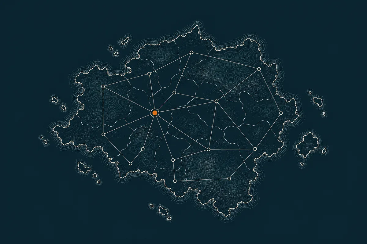
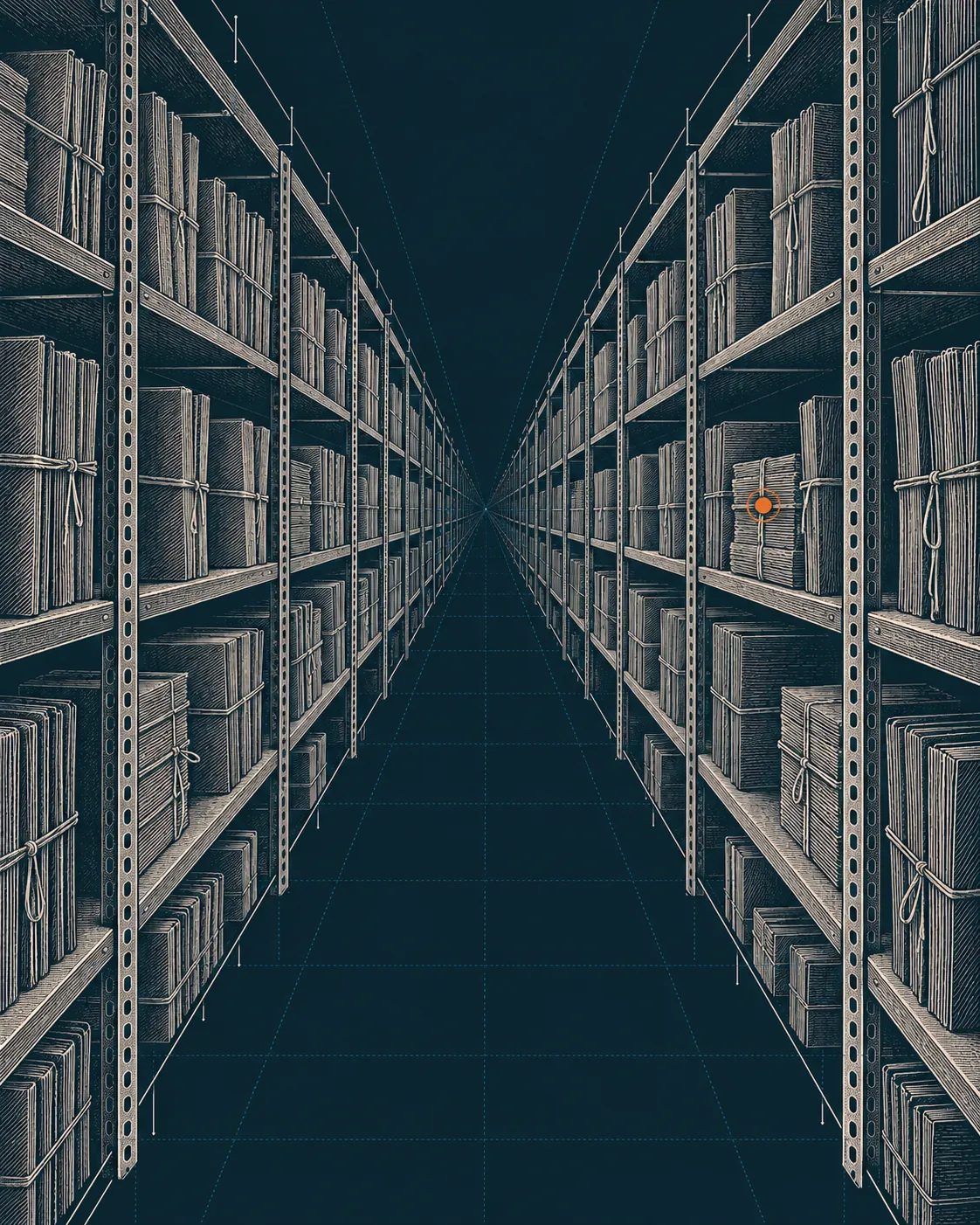
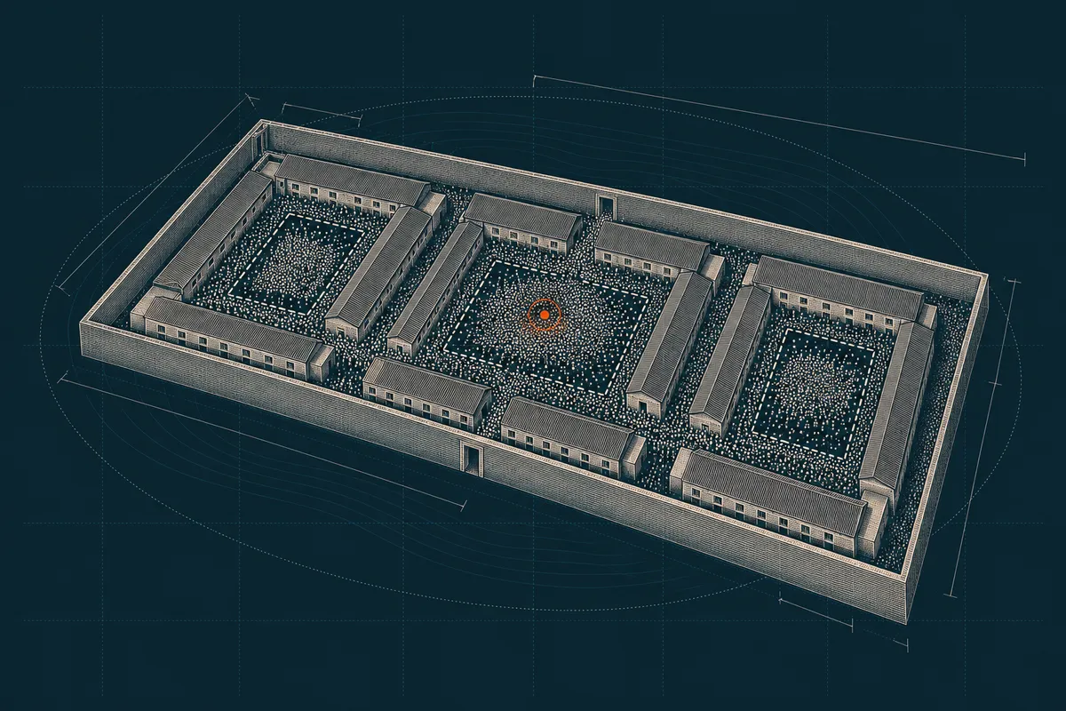
Evidence Plates: etched, two-tone, technical, one amber point. Bone copperplate hatching on a flat Ink ground, with fine technical hairlines and a single Signal pressure point. Registries, architecture, terrain and data – never gavels, scales, flags or identifiable people, and never text in the image.



08Do’s & don’ts
Use the artwork. Don’t redraw it.
Always start from the supplied files. The logo is outlined artwork: it should never be re-typed, recoloured or rebuilt.
-
Do use full colour on Paper or white.
-

Do use the on-dark version on Ink.
-


Do reverse to white over calm, dark areas of imagery.
-

Don’t recolour the mark or the pressure point.
-
Don’t stretch, squash or rotate it.
-
JUSTICE AUDIT
Don’t re-type the wordmark or set it in another font.
-
Don’t use the on-dark version on light grounds.
-
Don’t place the colour logo on mid-tone or busy grounds.
-
Don’t add shadows, outlines, gradients or effects.
09Downloads
Everything, in one kit.
Outlined SVG masters (no fonts needed), transparent PNGs at 512 and 1,024px wide, and the favicon and app-icon set.
Download the logo kit| Lockup | Colour | Colour on dark | Mono ink | Mono white |
|---|---|---|---|---|
| Horizontal | SVGPNG@2x | SVGPNG@2x | SVGPNG@2x | SVGPNG@2x |
| Stacked | SVGPNG@2x | SVGPNG@2x | SVGPNG@2x | SVGPNG@2x |
| Mark | SVGPNG@2x | SVGPNG@2x | SVGPNG@2x | SVGPNG@2x |
| Wordmark | SVGPNG@2x | SVGPNG@2x | SVGPNG@2x | SVGPNG@2x |
| App icons | Favicon SVGApple touch 180Icon 192Icon 512Manifest | |||

































Typeface: Newsreader by Production Type, SIL Open Font License. Questions about the brand: info@justiceaudit.org.
→Your question
Start with the question you are facing.
Choose the question closest to yours and tell us a little about your context.